/ \
/ ─ ─\ ”What’s that sound coming from the offices?”
/ (●) (●) \
| (__人__) | ))
/ ∩ノ ⊃ /
( \ / _ノ | |
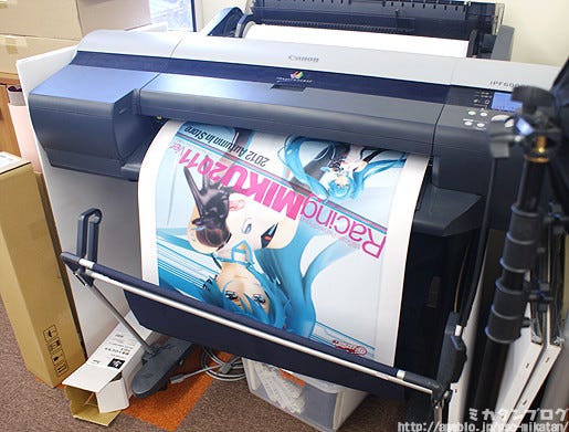
Printing a Racing Miku Poster!
If you head over to the shops you’ll see many hobby stores have these posters made by the GSC design team up on the walls now!
This big printer prints out the posters in full size, and they are then checked for balance and tone issues before heading out to the shops!
But anyway… now that the posters are done, time for me to take a look at the prototype!
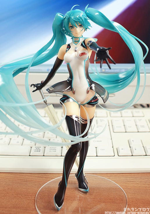
Racing Miku 2011 ver.!
The champions of the 2011 SUPER GT 300 class series – GSR&Studie with TeamUKYO! Racing Miku was their official mascot throughout the tournament, based on the illustration by Yuichi Murakami!
The figure is a lovely 1/8th scale! (・∀・)ノ
Racing Miku 2011 has a very mature feeling about her design, and from my point of view that comes across very nicely in the figure!
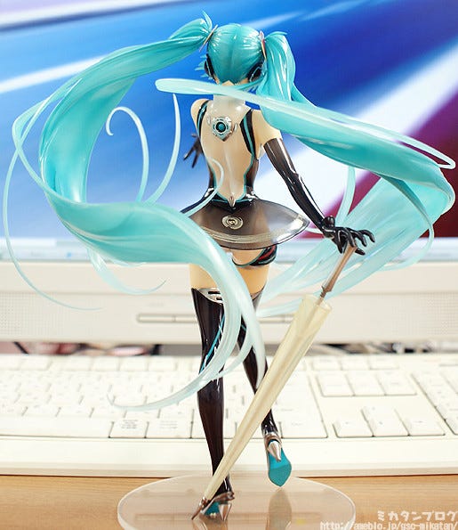
This is how she looks from the back!
The sculpting work on those long twin tails is incredible! They are twisting and winding all around, with thin little hairs branching out all over the place…. it’s really beautiful! You can look at her from any angle and still be astounded by the way the hair twists and winds around her.
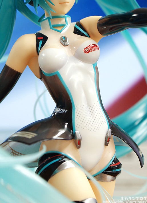
Yuichi’s design has been faithfully reproduced!
The paint work on her outfit – even just the front side – is so intricate!!
Another highlight for me is the slightly see-though area between her neck and her breasts. It may be hard to see it in this picture, but it is really beautiful to see up close!
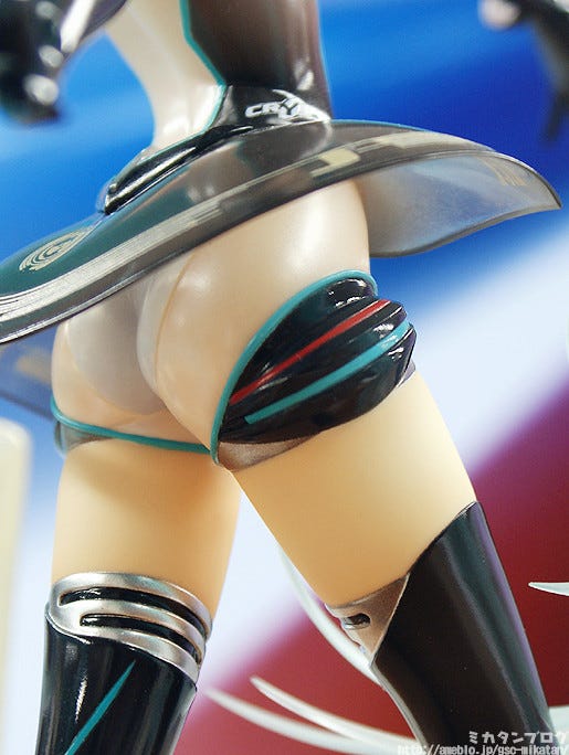
Would anyone who would say no to these legs?
No way! I’m absolutely certain that everyone has to approve of these beautiful legs! The silver on the boots also contrasts very nicely with the black boots.
Plus we have more of the thin see-though material!
From the pelvis down to the black accessory on her legs there is more of the see-though look that really gives her a sexy appearance! There are also more silver bands that contrast the colors of the figure so perfectly!
We all love to see some bare skin on our figures, but this thin see-though material somehow gives the figure a whole new kind of charm!

A very mature looking Miku-san!
Her expression gives off an air of confidence, but also comes across as very gentle. It really seems like Yuichi-san’s beautiful illustration has jumped off the drawing board and into the real world!
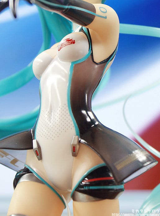
Today’s best shot!
/ \ /\
. / (ー) (ー)\ ”You can see her armpits and thighs at
/ ⌒(__人__)⌒ \ the same time! It’s perfect!”
| |r┬-| |
\ `ー’´ /
ノ \
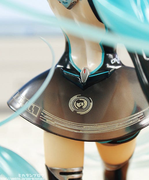
The outfit makes lots of use of clear parts!
Plus, areas like this skirt are not only made from clear plastic, but are also painted with a gradient that makes certain areas more clear than others.
Another interesting thing I noticed is that the body and the skirt don’t seem to be separated at any point – I’m not sure how that will work through production… :P
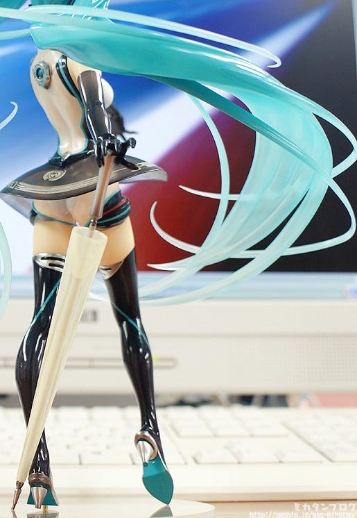
Her hair and the parasol also use clear plastic!
The parasol is a kind of clear silver that looks really incredible! Plus I have to mention the stunning hair once again – just look at it!
If you look at her heels in this photo you’ll also see the heel seems to be floating a bit – it’s balanced on a tiny little clear part to make it look like that. The small little details all come together to create a really stunning figure!
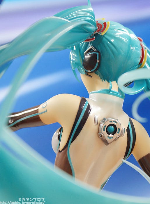
Miku has to have a decorative headset!
The 2011 Racing Miku really had an incredibly unique design – the headset design actually looks more like a hair accessory, which really makes her look very cute!
Seeing the extra volume on the left side of the picture, I can also mention once again that Racing Miku’s body is definitely more mature than the normal Miku… :P

Racing Miku 2011 ver.!
She’ll be on the GSC website and up for preorders from tomorrow! (`・ω・´)ゞ
Be sure to contact our partner shops if you have any preorder or sales queries!
But that’s all for today!
I hope to see you all again tomorrow!! (・∀・)ノ゛
(C) Yuichi Murakami / Crypton Future Media, Inc
